augusti 15, 2019

Freight Planner

I was responsible for the UX and UI of Stena Lines Freight Planner app. An extension to the Stena Line Extranet portal, but with easier and more modern look and feel. Largely the design was based on the Material Design visual language, but with the colors of Stena Line.

Below you can see how we went about working from start to release of the app.

Research

Understand the goal. Define it.
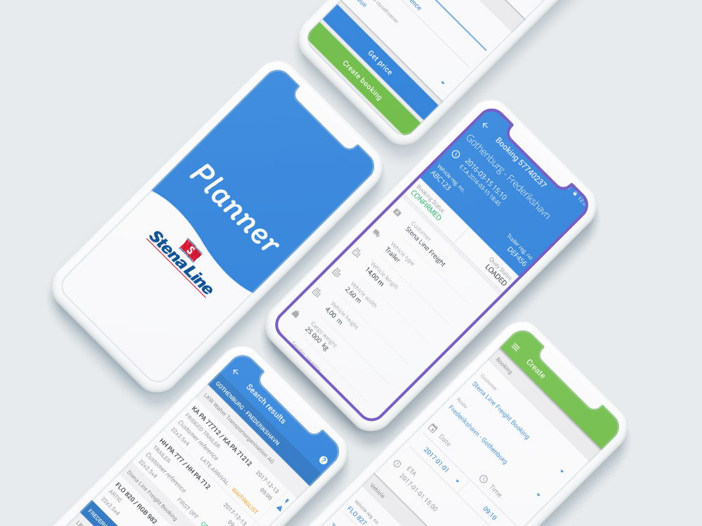
The users needed a mobile friendly on-the-fly solution for specific tasks in the booking system. The stakeholders wanted specifically a native app, not a responsive site. Hence, we should develop an app with the most used tasks, and it should be very easy and intuitive to use.
Identify stakeholders
We gathered our top booking managers across Europe and named the co-stakeholders along with the man with the money bag at Stena Line.
Explore current situation and solution.
The current web solution was built a long time ago. It was everything but fast. The interface was desktop only, resulting in a lot of zooming and panning when used on mobile.

What does the users want?
A mobile friendly and fast interface to the booking system. Something that could be used with one hand in the supermarket or at home in the sofa. Create new or change existing bookings quickly.

Analysis

Collect data from existing solution
We hade several years of website analytics that guided the workshops in the Ideation phase.
Create impact map
We identified a number of user behaviours and defined what tasks they wanted to do. This was brought to the table in the workshops.

Ideation

Workshops
The stakeholders was invited to several workshops with time for team feedback in between. This resulted in a sorted list of must haves and wants.
Brainstorming
The stakeholders and the developers discussed how things could look and function. Stakeholders explained what the system did today, what was missing and mentioned important details and quirks that need to be handled.
Co-creation
I created basic wireframes and sketches and sent to stakeholders. At times we sat together and changed design with inputs from the stakeholders. A very effective way to polish the end design.
Consolidate experts
At all time we could ask the stakeholder who had worked with the current system for years. We were fortunate to have this luxury in the project, and this resulted in phenomenal success. We also had access to experienced backend developers and a project manager that knew the business.

Iterative refinement

Gather feedback
Each sprint build was sent to the stakeholders and their teams, so they could test the app in real life situations. Feedback was sent to us and we made changes in the backlog accordingly.
Refine and categorize ideas
Based on feedback, new ideas came up or we changed details or solutions.
Create prototypes
Interactive design sketches was sent out to the stakeholders before development was considered.
Present solutions
Design sketches was finalized before they became tasks for the next sprint.

Solution

The developed solution was tested on the field with real data. Feedback was gathered.
Went back to Iterative refinement at end of sprint.

Each sprint lead to a more polished result. In the end an app that did exactly what the customers wanted was released on app store.

Great success!
eyepushpinlaptop-phoneredofunnel linkedin facebook pinterest youtube rss twitter instagram facebook-blank rss-blank linkedin-blank pinterest youtube twitter instagram